Politics
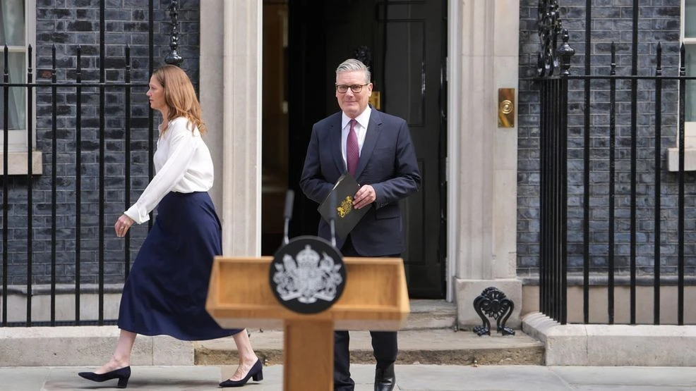
Starmer's first year in power faces scrutiny across key policy areas

BBC Verify’s six charts ask a basic question with political consequences: after Labour’s landslide on 4 July 2024 and Keir Starmer’s move into Downing Street the next day, how much has actually changed? The answer is more complicated than a simple win-or-lose scorecard. In several areas the government can point to movement, but the figures also show how much of the challenge was inherited, and how slowly the hard numbers shift.
The post-election honeymoon faded quickly
The comparison starts from a moment of unusually strong political capital. Labour won the UK general election on 4 July 2024, and Starmer became prime minister on 5 July 2024, immediately after a landslide victory. That matters because the first weeks in office came with a post-election goodwill period in opinion polling, when new governments often benefit from a reset in public expectations.
YouGov’s figures capture that early bounce and its limits. Starmer’s positive rating stood at 44% in the first days after the election, then slipped to 40% later in July 2024. That four-point drop is not a collapse, but it does show how quickly the public mood began to harden even before the government had settled into office. For a government promising change, that early movement in sentiment is one of the first signs that political patience would not be unlimited.
The economic backdrop was better than the political inheritance
Any verdict on Labour’s first year has to start with the economy it inherited. The UK had emerged from recession in early 2024, according to revised official figures, so the new government did not begin in the middle of a fresh downturn. That makes the economic charts easier to misread if they are treated as a pure test of ministerial competence rather than a comparison with a cyclical recovery already under way.

Official labour-market data for July 2024 were also being published just after the new government took office, which underscores how slowly some economic indicators move relative to political change. The point for voters is not whether one month looks better than the last, but whether the government can sustain improvement in growth, jobs and living standards after the post-recession bounce has already begun. In other words, the relevant question is not only what moved after 5 July 2024, but whether ministers can claim credit for a trend they did not start.
Migration offers one of the clearest benchmarks
If one policy area gives critics and supporters a common set of numbers, it is migration. The Office for National Statistics published provisional long-term migration figures for the year ending June 2024, and later data for the year ending December 2024 showed net migration at +431,000, down from +860,000 a year earlier. That is a very large numerical fall, and it gives Labour both an opportunity and a problem.
The opportunity is political: any reduction can be presented as evidence that migration pressure is easing. The problem is attribution. Because these are year-ending figures, they reflect flows that stretch across two governments and cannot be read as a simple before-and-after verdict on Starmer alone. For voters, the key issue is whether the government can show durable control over the system, not just a lower end-of-year total that may still leave migration historically elevated.
That distinction is central to BBC Verify’s approach. A headline drop in net migration is meaningful, but it does not automatically answer whether the government has changed the structure of the system, tightened enforcement, or simply benefited from shifts already in motion. The benchmark is useful precisely because it forces both sides to argue from the same official data.
Health remains a test of scale, not slogans
The NHS is the clearest example of a problem that cannot be fixed on a campaign timetable. NHS England’s referral-to-treatment data are the official measure for consultant-led waiting times, and they remain one of the most politically sensitive indicators in the system. But the broader context matters just as much as the latest month’s numbers. BBC’s earlier NHS analysis made clear that the health service had been under severe pressure for years before Labour took office, with long waits and workforce strain already entrenched.
That history complicates any straight comparison between promises and outcomes. A government can announce a direction of travel, but the waiting-list problem is so large that even real progress may look modest in the first year. The chart to watch is not whether the NHS feels better politically, but whether RTT figures begin to move in a sustained way that patients can actually feel. If the numbers do not improve, ministers will be judged against both their own promises and a long record of pressure that pre-dated them.
Housing shows how slowly delivery becomes visible
Housing is the area where the lag between policy and measurable result is most obvious. Homes England reported 35,676 housing starts and 32,834 completions in financial year 2023-24. Those figures set the scale of the challenge facing any new government that says it wants to accelerate delivery, because they show how much construction has to happen before voters see new homes on the ground.

The timing of the data matters as much as the totals. Housing-supply figures for July to September 2024 were published in January 2025, which means the first signs of any Starmer-era change would arrive with a delay. That lag makes housing a poor arena for instant verdicts and a better one for judging whether promises are building into a pipeline. Starts are the leading indicator; completions are the proof. If the starts do not rise first, the completions will not follow.
For Labour, this is the hardest kind of policy test: visible improvements require time, planning and continuity, while the political clock moves much faster. For voters, the crucial number is not only how many homes are completed, but whether the system is producing more capacity than the previous one.
What the charts really measure
Taken together, the six charts are not a simple scoreboard on one government. They are a measure of how far Labour has moved from the position it inherited, how much of the country’s recent performance was already shaped before 5 July 2024, and how much public goodwill remains after the honeymoon phase has passed. Starmer can claim some movement where official figures point to change, especially on migration, but the deeper story is mixed.
That is why the numbers that matter most are the ones that combine politics with institutions: favourability, because it shows whether public confidence is holding; migration, because it captures a major area of government control; NHS waiting times, because they test state capacity; and housing starts and completions, because they reveal whether promises are turning into delivery. The first year has not produced a clean verdict, but it has clarified the test Labour now faces: convert inherited momentum into durable results before the public decides the gap between promise and outcome is the real story.
Sources
- [1]bbc.com
- [2]yougov.com
- [3]ons.gov.uk
- [4]gov.uk
- [5]assets.publishing.service.gov.uk
- [6]england.nhs.uk
- [7]bbc.co.uk